Lesson 2: Analytics Made Easy
SEO and Analytics
Section outline
-
Lesson 2: Analytics Made Easy
-
Students mustMark as done
Why is Tracking Metrics Essential?
Creating content without looking at analytics is like driving a car blindfolded. Tracking metrics is essential for three reasons:
- Efficiency: It saves you time and money. If short 15-second TikTok videos bring you 10x more volunteers than long articles, data tells you to stop writing articles.
- Proving Impact: Donors and Web3 grant programs want proof. Saying "Our educational campaign reached 50,000 youths and drove 1,200 website clicks" gets you funded. Data is the language of trust.
- Audience Alignment: Data tells you who is actually watching. It helps you pivot your message to match the people who actually care.
Vanity Metrics vs. Actionable Metrics
Before we look at dashboards, we must address the biggest trap in digital marketing:
Vanity Metrics
are numbers that look great on paper and boost your ego (like getting 10,000 Likes on a cute photo), but they do not translate to real-world results. Likes do not fund clean water wells.Actionable Metrics
are numbers that directly connect to your project's goals (like Link Clicks, Telegram Joins, or NFT Mints). Always optimize your strategy for action, not just applause. -
Students mustMark as done
Aligning Goals and Metrics: The Analytics Funnel
You do not need to track everything. Think of your audience's journey as a funnel:
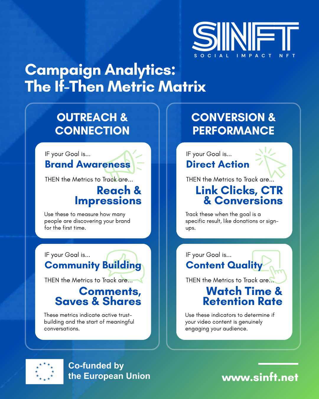
- Top of Funnel - Awareness (Discovery): Goal is to let the world know you exist.
- Track: Reach (unique people who saw your content) and Impressions (total times displayed).
- Middle of the Funnel - Consideration (Trust Building): The goal is to get people to care.
- Track: Engagement Rate, and "Super Likes" like Saves and Shares.
- Bottom of Funnel - Action (Conversion): The goal is to get people to donate or mint.
- Track: CTR (Click-Through Rate) and Conversion Rate (how many actually completed the final action).
Keep this simple reference matrix handy. Whenever you launch a post or campaign, ask yourself what your goal is, and then only look at the matching metrics!
- Top of Funnel - Awareness (Discovery): Goal is to let the world know you exist.
-
Students mustMark as done
Tools Overview: Where to Find Your Data
You do not need expensive, enterprise-level software or a degree in data science to understand your audience. The best tools are completely free. However, looking at raw data without context is just noise.
To build a successful strategy, you need to look at your data through three different lenses: Macro (what the world cares about), Meso (how the public reacts to your brand), and Micro (how your core community behaves).
We have prepared a comprehensive visual guide to help you navigate these three layers. Review the presentation below to see exactly where to click and what graphs to analyze.
The Three Core Analytical Lenses
As highlighted in the visual guide, mastering these three tools gives you a complete picture of your digital impact:
-
Google Trends (The Macro Lens): This is your "Before You Post" tool. It doesn't track your content; it tracks the world's curiosity. You use this to see if people are actually searching for your topic right now, and to compare keywords to ensure you are using the exact language your audience uses.
-
Meta Business Suite (The Meso Lens): This is your main control center for Facebook and Instagram. Here, you discover who is actually engaging with your brand (Age, Gender, Geography) and which specific formats (Reels, Carousels, Stories) are successfully driving "Link Clicks" to your website or mint page.
-
Telegram Statistics (The Micro Lens): This measures the heartbeat of your most loyal supporters. By looking at "Views by Hour" and "Private Shares" in your Telegram channel, you learn exactly when your core community is awake, active, and willing to advocate for your cause behind closed doors.
A Note on Native Platforms: While we focused on these three foundational tools, remember that almost every modern platform has its own built-in analytics. Whether you are posting short videos on TikTok, building a Web3 server on Discord, or uploading documentaries to YouTube, you can always find an "Insights" or "Analytics" button near your profile. The metrics (Retention Rate, Clicks, Demographics) follow the exact same logic we discussed above.
🚨 What If the Statistics Are "Bad"?
Do not panic. A "bad" number is a highly valuable diagnostic tool. It is the audience quietly telling you something is broken. Did you post at 2:00 AM? Was the topic irrelevant to Google Trends? Was the video too long? Embrace the "Failing Forward" mindset. A failed post is just an experiment that taught you what not to do. -
-
Students mustMark as done
Evaluating What Content Works Best: The Iterative Process
Analytics are useless if you don't change your behavior based on the results. Use this 4-step framework:
- Identify the Outliers: Find your Top 3 posts (highest engagement) and Bottom 3 posts at the end of the month.
- Analyze and Ask "Why?": Did the Top 3 have human faces? Were the Bottom 3 full of corporate jargon?
- Form a Hypothesis: e.g., "Our audience ignores graphic posters, but engages with real photos of volunteers."
- Test & Implement (A/B Test): Launch two similar posts next week (A: poster, B: photo). If the photo gets 5x more clicks, your hypothesis is proven. Adjust your strategy!
Example: A mental health charity noticed their long, academic articles were getting 0 shares and very few website clicks. They looked at their data and saw that a quick, 3-slide infographic they posted months ago had 500 shares. They evaluated the data, stopped writing long articles, and switched entirely to educational infographics. Their organic reach grew by 400% in two months, and their volunteer sign-ups doubled because the content was finally easy to consume.
-
Guide & Glossary: The Analytics Dictionary
Whenever you get confused by an analytics dashboard or marketing jargon, refer back to this simple dictionary.
If you learn something new about the topic, feel free to add it and share it with others in this glossary!
-
Ready to test your knowledge?
Take this quick 5-question quiz to review the key concepts covered in this lesson. This brief knowledge check will help you reinforce what you've learned and ensure you're ready to apply these new strategies to your own project.

Shape the Future.
Mint the Change.