
Lesson 3: Reporting Impact — Telling the Story with Data
SEO and Analytics
Section outline
-
Lesson 3: Reporting Impact — Telling the Story with Data
-
Students mustMark as done
Why is Reporting Impact Important?
In traditional philanthropy, donors write a check and hope for the best. In the Web3 space, the rules have changed. Trust is your most valuable currency, and the community expects real-time, verifiable proof.
Transparency (Destroying FUD)
The Web3 space has seen scams, making audiences naturally skeptical. Showing exactly where the money went destroys FUD (Fear, Uncertainty, Doubt).-
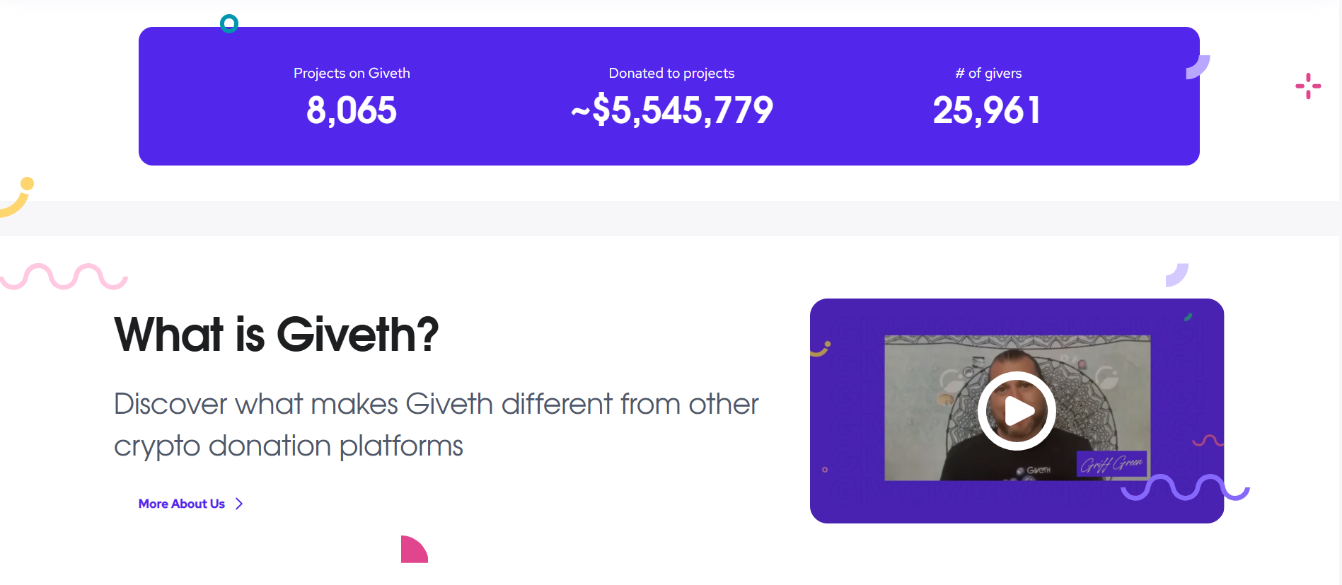
Mini-Case Study: Giveth.io uses a "Traceability" feature where donors can literally trace their crypto from their wallet to the project's wallet.
👆 Click the picture to visit the site
Credibility (Attracting Bigger Partners)
To secure major Web3 grants or partner with legacy charities, an impact report serves as your portfolio of execution.
-
-
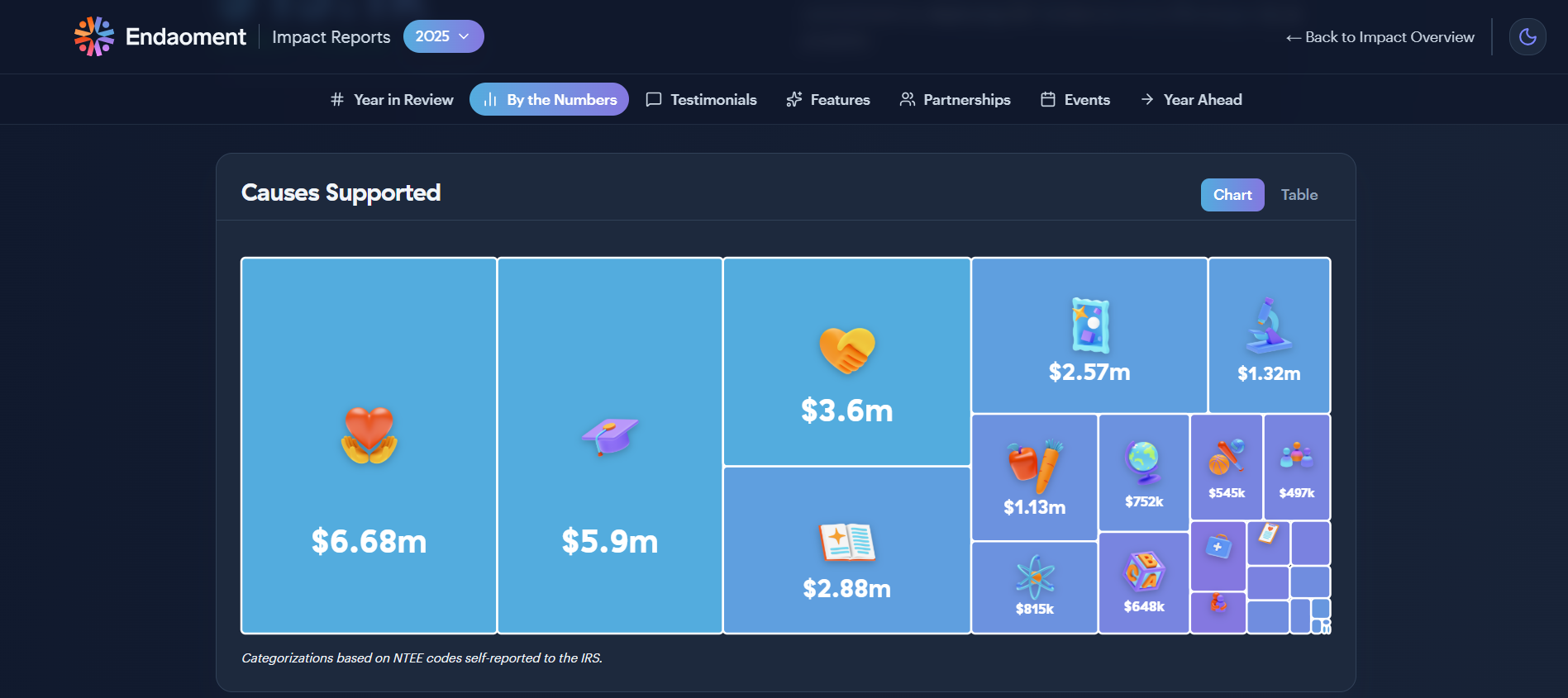
Mini-Case Study: Endaoment.org (the first on-chain 501(c)(3)) publishes visually stunning, data-heavy reports, allowing them to partner with skeptical legacy charities like the American Red Cross.
-
👆 Click the picture to visit the site
The Loop of Engagement (Motivating Supporters)
When a community member sees that their specific NFT purchase planted 500 trees, they feel like heroes.
-
-
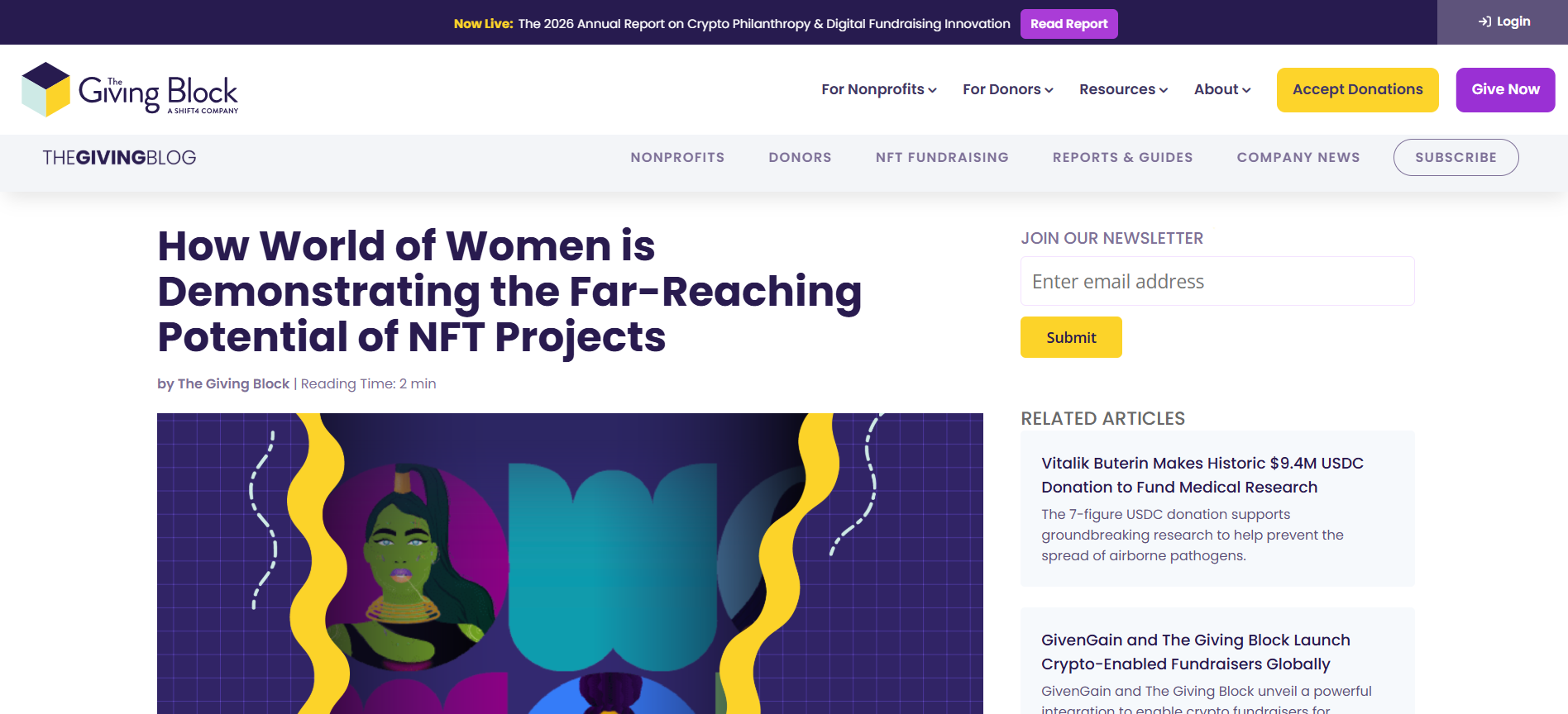
Mini-Case Study: World of Women (WoW) continuously reported how NFT sales funded women's charities, turning casual flippers into long-term brand advocates.
-
👆 Click the picture to visit the site
🚨 The Cost of Silence
What happens if you don't report? In the fast-paced digital world, silence is often interpreted as a "Rug Pull" (a scam). Even if your team is working incredibly hard behind the scenes, if you do not report that progress visually to your community, they will assume you took the funds and abandoned the project. Always over-communicate your impact. -
-
Students mustMark as done
Understanding Impact Reports
A modern impact report is not a boring 50-page PDF. It is a visual storytelling tool. It usually takes one of four forms:
-
The One-Page Infographic (X/Discord announcements).
-
The Social Carousel (Instagram/LinkedIn breakdowns).
-
The Dynamic Dashboard (Notion/Dune Analytics for live Web3 data).
-
The Mini-Documentary (TikTok/YouTube Shorts).
The 5 Categories of Impact
Blend these five categories to tell a complete story:
-
Financial (Inputs): Resources gathered ("15 ETH Raised").
-
Operational (Outputs): What was created ("20 Laptops Delivered").
-
Human (Outcomes): How lives changed ("School attendance rose 40%").
-
Community (Engagement): Supporter involvement ("50 active volunteers").
-
Web3/On-Chain (Verifiability): Blockchain proof ("1,200 Unique Wallets").
The "Hero Metric":
Never overwhelm your audience with 20 different statistics on one page. Choose ONE "Hero Metric" — the single most impressive and understandable number of your campaign — and make it the star of your report.Real-World Masterclasses in Impact Reporting
To understand what a great impact report looks like, we need to study the best projects. Click through these real, working examples to see how top-tier organizations blend Web3 tech, traditional philanthropy, and beautiful data visualization.
Case Study 1: Gitcoin (The Web3 Standard)
 👆 Click the picture to visit the site - Gitcoin Impact Portal
Gitcoin is the gold standard for funding public goods in Web3. Their impact page doesn't just say "we do good." It uses massive, live Hero Metrics right at the top (e.g., "$60M+ Total Funding Distributed," "3.8M+ Total Donations").
The Lesson: They use clean, interactive dashboards. They don't hide the numbers; they make the data the art. If you are building a Web3 project, this is the level of transparency your community expects.
Case Study 2: Plastiks (Verifiable Physical Impact)
👆 Click the picture to visit the site - Plastiks.io
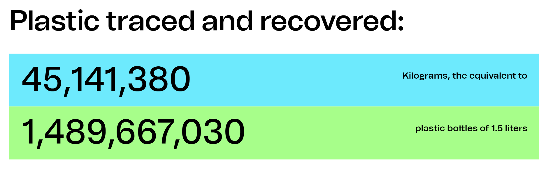
Plastiks bridges Web3 and environmental cleanup. Instead of vague promises, their platform uses NFT utility to track physical plastic recovery. Their dashboards show exactly how many kilograms of plastic have been collected, verified, and recycled globally.
The Lesson: Tie your digital asset to a physical, measurable unit (e.g., 1 NFT = 10 kg of plastic recovered). By building a live dashboard around a single "Hero Metric," you prove that your digital tokens have a tangible, real-world footprint.
Case Study 3: charity: water (Proof through Technology)
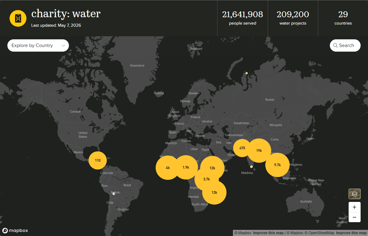
👆 Click the picture to visit the site - charity: water
They pioneered the 100% transparency model in modern philanthropy. They don't just say they build wells; they use GPS coordinates, remote sensors, and mapping technology to provide undeniable visual proof of every single completed water project around the globe.
The Lesson: If your social impact is tied to a physical location (planting trees, building shelters, delivering supplies), map it. Abstract numbers become intensely real and trustworthy when supporters can see the exact location on Google Earth and view photos of the specific community they helped.
-
-
Students mustMark as done
Presenting the Data Clearly: The 3 Visual Strategies
Data is entirely useless if it is confusing. In the era of social media, you have exactly 5 seconds to capture your audience's attention before they swipe away.
To stop the scroll and build radical trust, you must move from merely "reporting" data to "translating" it. Your donors and holders do not want to read an Excel spreadsheet on Instagram; they want to see a story.
We have analyzed the best impact campaigns across Web3 and traditional philanthropy to extract their design secrets. Before we break them down textually, we have prepared a visual masterclass.
👇 Click through the presentation below to see real-world examples of how to design an impact report that builds trust and drives action.
Decoding the Presentation: The 3 Core Strategies
-
The "Wrapped" Aesthetic (Personalized UX): Shift focus from "what we did" to "what YOU unlocked." Frame operational outputs as human wins.
-
The B2B Logo Power-Play & Gamification: Blend established legacy logos with Web3 digital assets to bridge physical impact and digital space. Add progress bars to carousels to prevent drop-off.
-
The "Agency" Narrative (Raw Humanity): State clearly: "They did it themselves." Highlight the agency of the recipients. Reject polished stock photos for raw, authentic documentary footage.
Explore the Campaign References
To see exactly how these strategies look in the wild, click through the original Instagram campaigns we analyzed in the presentation:
🔗The "Wrapped" Aesthetic: charity: water "2025 Wrapped" Campaign
🔗The B2B Collage & Gamification: Plastiks "2024 Recap" Campaign
🔗The Cohesive Series: Pencils of Promise "Season of Promise" Campaign
🔗The "Agency" Documentary Video: GiveDirectly "Malawi Cash Transfer" Campaign -
-
Students mustMark as done
Sharing the Report: The "Hub and Spoke" Distribution Strategy
Creating the report is 20% of the work. Distribution is 80%.
-
The Hub (Permanent Archive): A dedicated webpage or Notion workspace containing the full report, financial breakdowns, and hyperlinks to Etherscan smart contracts for on-chain verification.
-
The Spokes (Micro-Content):
-
Instagram/LinkedIn: 5-slide visual carousel.
-
X (Twitter): A data-heavy "Mega-Thread".
-
TikTok/Reels: A raw, short-form video from the founder.
-
Owned Channels: Send a personalized email newsletter and host a Live Voice AMA in Telegram/Discord for your core community first.
-
The Amplification Loop: Empowering Your Holders
The ultimate goal of an impact report is to make your community feel like heroes. When they feel proud, they will share it for you.
-
Provide your Telegram/Discord members with a "Click-to-Tweet" link so they can instantly share the Hero Metric on their own profiles.
-
Give them custom digital badges or graphics that say "I funded this" to post on their Instagram stories. Turn your community into a decentralized marketing team!
The 5-Day "Content Waterfall" Launch Schedule
Do not release all your content on the same day! Treat your Impact Report like a major product launch to keep your project trending for a whole week.
📅Day 1 (The Inner Circle): Drop the report exclusively in your Telegram/Discord chat and send the Email Newsletter. Make your holders feel special.
📅Day 2 (The Visual Drop): Publish the 5-Slide Carousel on Instagram and LinkedIn.
📅Day 3 (The Deep Dive): Publish the analytical Mega-Thread on X (Twitter).
📅Day 4 (The Human Face): Post the short-form raw video on TikTok/Reels explaining the biggest "Win" from the report.
📅Day 5 (The Live Celebration): Host a live Voice AMA in your Discord/Telegram to answer questions, celebrate the metrics, and discuss the roadmap for the next campaign. -
-
Ready to test your knowledge?
Take this quick 5-question quiz to review the key concepts covered in this lesson. This brief knowledge check will help you reinforce what you've learned and ensure you're ready to apply these new strategies to your own project.

Shape the Future.
Mint the Change.