
Branding, Content and Ethics
Designing Eye-Catching Visuals
Why Visuals Matter? The Power of Visual Communication
People process visual information faster than text.
Strong visuals:
- Capture attention
- Increase engagement
- Improve understanding
- Create emotional connections
- Encourage action
· What makes you stop scrolling and pay attention to a social media post? Every day, people are exposed to thousands of pieces of content online. Most users decide within seconds whether something is worth their attention. This means that visuals often determine whether people continue reading or move on. Think about your own social media habits. Which posts catch your eye? Often it is not the amount of information but how that information is presented. The primary goal of a visual design in a digital content is to communicate messages clearly and attract attention.
Beyond Aesthetics
Successful NFT projects combine:
1.Attractive visuals
2.Clear messages
3.Emotional connection
4.Meaningful impact
Social-impact NFTs should communicate:
- The cause
- The purpose
- The people involved
- The expected impact
The Five Principles of Good Design
Core Design Principles
1.Color
2.Typography
3.Balance
4.Contrast
5.Composition
These principles help transform ordinary content into effective visual communication. These five principles form the foundation of almost every successful design. You do not need expensive software or advanced skills to use them. Understanding these principles will already improve the quality of your content significantly.
Colors Influence Emotions
The color that you choose can influence how your target audience feels audience feels about your brand. Below are some examples of emotions evoked by colors.
|
Color |
Common Associations |
|
Blue |
Trust, reliability |
|
Green |
Nature, growth |
|
Yellow |
Optimism |
|
Red |
Passion, urgency |
|
Purple |
Creativity |
|
Orange |
Energy |
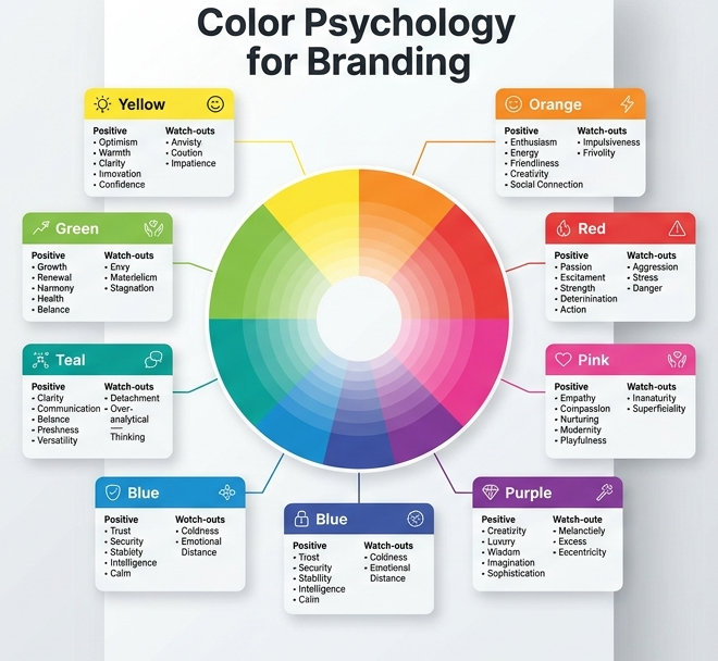
Different colors can trigger different emotional responses and influence how audiences perceive a project. When designing content for social impact initiatives, color choices should support the project's message and values.
Keep It Simple
Best practices:
1.Use 2–4 main colors
2.Maintain consistency
Ensure readability
Match colors to the project's purpose
Useful Tool (Coolors) – Generate professional color palettes quickly.
One common mistake is using too many colors.
Too many colors can confuse viewers and weaken the visual identity of a project.
A limited palette helps create consistency and makes content look more professional.
Examples of good and poor color combinations if possible.
Typography Matters
Choosing the Right Fonts
Serif Fonts
- Traditional
- Professional
- Trustworthy
Sans-Serif Fonts
- Modern
- Clean
- Easy to read
Design Rules
Use a maximum of two fonts
Create hierarchy with font sizes
Prioritize readability
Typography is not only about choosing fonts. It is about helping people understand information quickly and comfortably. For social media and NFT promotion, readability should always come before decoration. Participants should remember that simple typography often performs better than overly artistic fonts.
Balance and White Space - Organizing Visual Elements
Balance - Creates harmony and stability in a design.
White Space - The empty space around elements that improves clarity.
Benefits:
- Better readability
- Cleaner layouts
- Improved focus
- Professional appearance
· Many beginner designers feel the need to fill every available space. However, white space is an important design tool. It helps direct attention toward important information and prevents content from feeling crowded. Good design often means knowing what to leave out.
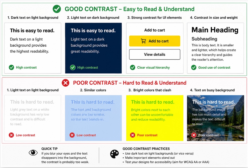
Contrast
Helping Important Information Stand Out
Contrast can be created through:
1.Colors
2.Font sizes
3.Shapes
4.Positioning
Benefits of good contrast
-Better readability
-Stronger visual impact
-Clearer communication
Contrast helps guide the viewer's attention. Imagine reading light gray text on a white background. It becomes difficult and frustrating. Good contrast ensures that important information is immediately visible and accessible to everyone.
Composition and Visual Hierarchy
Guiding the Viewer's Eye
People usually notice information in this order:
1.Headline
2.Main image
3.Supporting text
4.Call to action
Rule of Thirds
Divide your design into nine sections and place key elements along the lines or intersections. Composition determines how information is organized. A good composition naturally guides the viewer through the content without effort. Visual hierarchy helps people understand what is most important and what action they should take next.
Common Design Mistakes
Avoid These Common Errors
❌Too much text
❌Too many colors
❌Poor quality images
❌Inconsistent fonts
❌Weak contrast
❌Cluttered layouts
❌No clear message
Even experienced designers make mistakes.
Fortunately, many design problems can be avoided by keeping content simple, focused, and intentional.
When in doubt, simplify. A clear message is always more important than complicated design.
Useful Design Tools
The good news is that creating professional-looking content no longer requires expensive software.
These tools are beginner-friendly and widely used by organizations, creators, and marketers around the world.
Encourage participants to experiment with several tools and find the one they feel most comfortable using.
Canva
Templates and social media graphics
Figma
Collaborative design and layouts
Coolors
Color palette generation
Unsplash
Free high-quality images
Key Takeaways
Remember
✅Visuals attract attention
✅Design influences emotions
✅Simplicity is powerful
✅Colors communicate meaning
✅Typography affects readability
✅Every visual should tell a story
✅Social-impact NFTs need purpose, not only aesthetics

Shape the Future.
Mint the Change.